
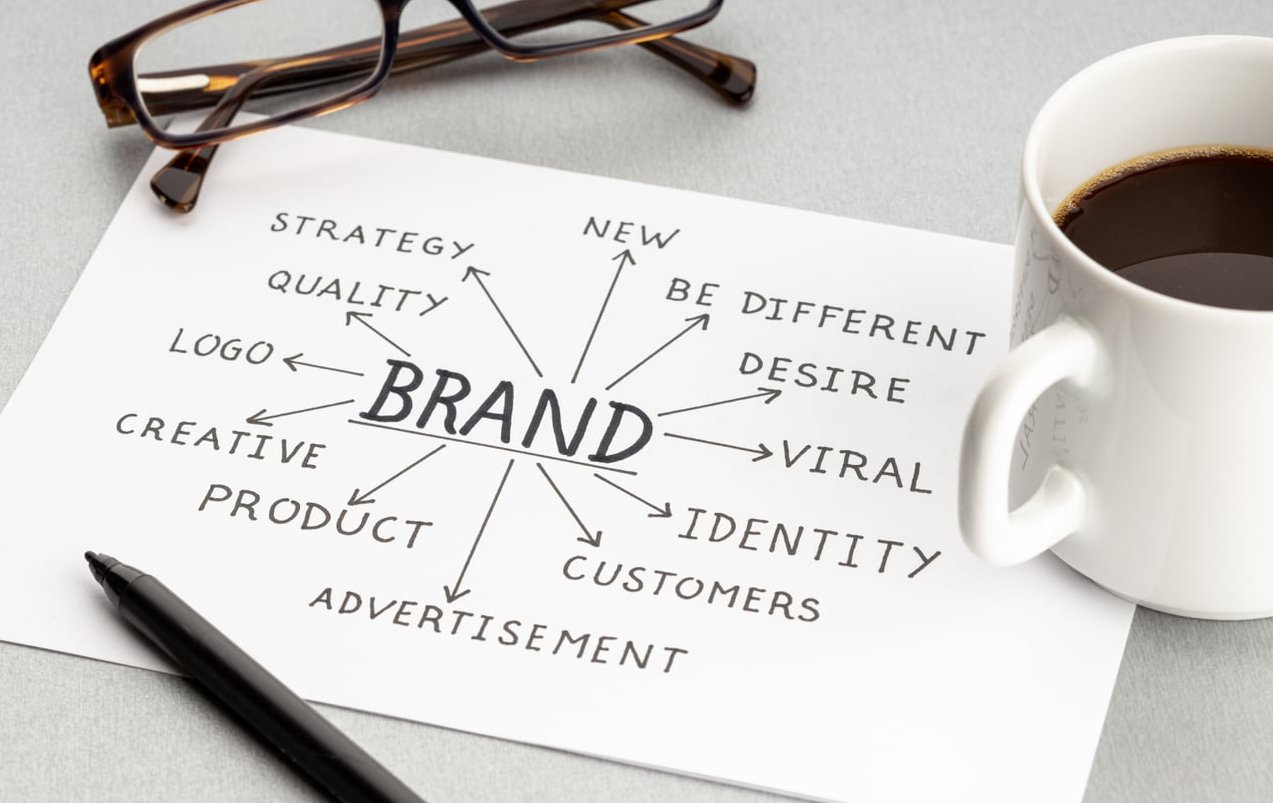
Short answer: a brand style guide is a written rulebook that tells anyone touching your brand exactly how to use your logo, colours, typography, imagery and words so that every ad, invoice, packaging label and Instagram post looks like it came from the same company. It is not a mood board and it is not a decorative PDF. Done properly, it is the cheapest quality control tool a small business will ever buy.
Most small business owners discover the need for one the expensive way: a printer produces a stretched logo, a freelancer picks a slightly different blue, an agency invents a new font because nobody told them which one to use, and suddenly you are paying twice for the same job. This guide breaks down the nine sections a usable brand style guide must contain, what each one has to specify in concrete terms, and exactly what weak guides leave out.
What is a brand style guide, precisely?
A brand style guide is a reference document (PDF, web page or shared workspace) that defines the visual and verbal standards of a brand and the rules for applying them. It answers three questions for every element of your identity:
- What is it? The exact asset, code or wording.
- How is it used? Sizes, spacing, placement, hierarchy, context.
- How is it not used? The forbidden versions, the misuse examples, the edge cases.
That third question is the one that separates a real style guide from a pretty summary of your identity. A guide that only shows what things look like leaves every judgement call to the person opening the file. A guide that shows what is forbidden removes the guesswork, and guesswork is what costs money.
Style guide, brand guidelines or brand book: is there a difference?
The terms overlap in daily use, but there is a practical hierarchy worth knowing when you brief a supplier. The team at brandkit.com reached a similar conclusion.
| Document | What it covers | Who uses it |
|---|---|---|
| Brand book / brand platform | Strategy: mission, positioning, values, personality, audience | Leadership, marketing, new hires |
| Brand style guide / brand guidelines | Execution rules: logo, colour, type, imagery, tone, applications | Designers, printers, agencies, freelancers, web developers |
| Design system / UI kit | Coded components, tokens, states, spacing units for digital products | Product designers and developers |
A small business rarely needs all three. It almost always needs the middle one.
Why a style guide is a money-saving asset, not a decorative document
Think of every brand asset you commission as a job with a briefing cost. Without a style guide, that briefing cost is paid again on every single job, by someone who is billing you by the hour.
| Situation | Without a style guide | With a proper style guide |
|---|---|---|
| New freelance designer starts | 2 to 4 hours of briefing, plus 1 or 2 revision rounds on brand basics | One file link, work starts the same day |
| Print run of packaging or signage | Colour shifts because no Pantone or CMYK values were supplied | Exact spot and process values, colour matched first time |
| Website redesign | Developer invents a type scale, headings drift from marketing material | Defined scale, weights and line heights handed over as specs |
| Trade show or event stand | Logo squeezed into a corner with no breathing room | Clear space and minimum size rules applied automatically |
| Social media handled by an intern | Random fonts, filters and phrasing week to week | Templates plus tone rules, output stays recognisable |
The value is not aesthetic, it is operational. Consistency reduces reprints, reduces revision rounds, shortens onboarding and protects the equity you have already paid to build.

The 9 sections every brand style guide needs
1. Brand foundations (the one page nobody should skip)
Before any rule, a short section explaining who the brand is. Not a philosophy essay, one or two pages maximum.
- Positioning statement in one sentence
- Three to five brand attributes with a short definition of each (for example: “Direct: we say the price, we do not hide it”)
- Primary audience and what they care about
- A “we are / we are not” list to set boundaries
What a weak guide leaves out: anything explaining why the design decisions exist. When a designer understands that the brand is meant to feel precise rather than playful, they make better calls in the situations your guide did not anticipate.
2. Logo suite and lockups
One logo file is not a logo system. Your guide must present and supply every authorised version:
- Primary logo (full lockup)
- Secondary or horizontal version for wide, shallow spaces
- Icon, monogram or symbol only for avatars, favicons and app tiles
- Monochrome versions: solid black, solid white, single colour
- Reversed version for dark backgrounds
For each, state the situation it is used in. “Use the horizontal lockup when the available height is less than 40% of the width” is a rule. “Here are our logos” is not.
What a weak guide leaves out: file formats and naming. Your guide should list which file to use where: SVG or EPS for print and cutting, PNG with transparency for digital, and a clearly named folder structure so nobody grabs a low resolution JPEG off the website.
3. Clear space, minimum size and misuse rules
This is the section that most cheap guides skip entirely, and it is the section printers and agencies open first.
- Clear space: define it with a unit taken from the logo itself, for example “the height of the letter P in the wordmark on all four sides”. A unit that scales beats a fixed measurement in millimetres.
- Minimum size: give two numbers, one for print (for example 20 mm wide) and one for screen (for example 90 px wide). Below that, specify the icon only version instead.
- Background rules: which colours the logo may sit on, what contrast level is required, and what to do over photography (usually a solid panel or a defined overlay opacity).
- Misuse examples: show the crossed out versions. Do not stretch, do not rotate, do not recolour, do not add drop shadows or outlines, do not place inside a shape, do not re typeset the wordmark, do not change the spacing between symbol and text.
What a weak guide leaves out: the misuse page. Without it, every abuse becomes a debate instead of a correction.
4. Colour system with exact codes for every medium
Colour is where inconsistency is most visible and most expensive. A usable guide gives four values for every colour, not just a HEX code.
| Role | HEX (screen) | RGB | CMYK (print) | Pantone (spot) |
|---|---|---|---|---|
| Primary | #1B3A5C | 27, 58, 92 | 92, 72, 34, 20 | PMS 302 C |
| Accent | #E8552F | 232, 85, 47 | 0, 78, 88, 0 | PMS 1665 C |
| Neutral dark | #212121 | 33, 33, 33 | 0, 0, 0, 90 | Black 6 C |
Beyond the swatches, define:
- Hierarchy: which colour is primary, which is accent, which are supporting neutrals
- Proportion: a rough ratio such as 60% neutral, 30% primary, 10% accent, so nobody floods a page with your loudest colour
- Approved combinations: which text colour sits on which background
- Accessibility: contrast ratios for text on each background, aiming for at least 4.5:1 for body copy
- Special substrates: vinyl, embroidery thread or paint references if you produce signage, uniforms or vehicles
What a weak guide leaves out: CMYK and Pantone values. A HEX only guide guarantees that your printed brochure will not match your website.
5. Typography: families, licences and a real scale
Naming two fonts is not a typography section. A usable one includes:
- The families and weights you are licensed to use, with the exact weight names (Inter SemiBold 600, not “the bold one”)
- Licence status and source: open source, purchased desktop licence, web font subscription. This protects you legally and stops a supplier substituting a lookalike.
- Fallback fonts for email, Office documents and systems where the brand font cannot be installed
- A type scale with sizes, weights, line height and letter spacing
| Level | Font and weight | Size (desktop) | Line height |
|---|---|---|---|
| H1 | Display SemiBold | 48 px | 1.15 |
| H2 | Display SemiBold | 32 px | 1.2 |
| Body | Text Regular | 17 px | 1.6 |
| Caption | Text Medium | 13 px | 1.4 |
What a weak guide leaves out: the mobile scale and the alignment rules. Add a second column for mobile sizes and state whether body copy is left aligned or justified. Small details, but they are the ones that make two pages designed by two people look like one brand.
6. Imagery and photo treatment
Photography is the fastest way for a brand to fall apart, because stock libraries offer infinite choice. Your guide should narrow that choice hard.
- Subject matter: what we photograph and what we never photograph
- Composition: tight crops or wide environments, centred or off centre, negative space for text overlays
- Lighting and mood: natural daylight, high key, moody, soft shadows
- Colour treatment: a defined grade, warm or cool, saturation range, any duotone or overlay recipe with exact values
- People: posed or candid, eye contact or not, diversity requirements
- What to avoid: obvious stock clichés, heavy filters, mismatched white balance
- Technical minimums: resolution, aspect ratios used across channels, file formats
What a weak guide leaves out: a side by side “yes / no” gallery. Six approved images next to six rejected images teaches more in ten seconds than a paragraph of adjectives.
7. Iconography, graphic elements and patterns
Anything recurring that is not the logo belongs here:
- Icon style: line or filled, stroke weight, corner radius, grid size
- Illustration style, if you use one
- Brand devices: shapes, rules, dividers, badge shapes, angle of any diagonal element
- Patterns and textures, with scale and permitted colourways
- Button and container shapes: corner radius, border weight, shadow rules
What a weak guide leaves out: stroke weight and grid. Icons drawn on different grids never sit together properly, and the inconsistency shows up in every interface and every brochure.
8. Voice, tone and copy conventions
Half of your brand is words, yet most small business guides stop at colours. Include:
- Voice attributes: three traits with a do and a do not for each
- Tone shifts: how you speak in a sales page versus a support email versus an apology
- Grammar and mechanics: British or American spelling, sentence case or title case for headings, Oxford comma or not, how you write numbers, dates, times, currency and phone numbers
- Vocabulary list: the words you always use, the words you never use, how the company name is written (capitalisation, spacing, legal suffix)
- Boilerplate: the standard 30 word, 50 word and 100 word company descriptions
- Before and after examples: a generic sentence rewritten in brand voice
What a weak guide leaves out: the mechanics. “Friendly and professional” tells a copywriter nothing. “We use contractions, we never use exclamation marks in support replies, we write prices as €1,200 not 1200 EUR” tells them exactly what to do.
9. Applications, templates and asset delivery
The final section turns rules into ready to use material. This is where a guide stops being theory.
- Business card, letterhead, email signature and invoice layouts
- Presentation deck template with cover, section and content slides
- Social media profile specs and post templates per platform, including safe zones
- Ad formats you run regularly, with logo placement and text hierarchy
- Packaging, labels, signage or vehicle livery if relevant to your sector
- Merchandise and uniform rules, including embroidery and single colour constraints
- A clearly organised asset folder plus a link to the live master version
What a weak guide leaves out: the files. A PDF describing your brand without a downloadable asset pack forces every supplier to recreate things by eye, which is precisely the behaviour the guide exists to prevent.
How to tell if your current guide is weak: a 12 point audit
Open your existing document and tick every item you can find in under 60 seconds:
- Clear space defined with a proportional unit
- Minimum size for print and for screen
- At least six logo misuse examples
- CMYK and Pantone values, not only HEX
- Contrast ratios or approved text/background pairs
- Exact font weight names and licence details
- Fallback fonts for Office and email
- A type scale with line heights
- Approved and rejected image examples
- Icon grid and stroke weight
- Written voice rules with examples
- A link to downloadable, correctly named files
Fewer than eight ticks means your guide is decorative. Suppliers will keep asking questions, and you will keep paying for the answers.
How long should a brand style guide be?
For a small business, 15 to 30 pages is the sweet spot. Under 10 pages and you are almost certainly missing clear space rules, misuse examples and copy standards. Over 60 pages and nobody reads it, which is functionally the same as not having one.
A useful test: could a competent freelancer you have never met produce an on brand flyer using only this document and the linked files, without messaging you once? If yes, the length is right.
How to build one in six steps
- Audit what exists. Collect every piece of material produced in the last two years and lay it out. The inconsistencies you spot become your priority rules.
- Lock the strategy first. Positioning and personality drive the visual decisions. Writing rules before this stage produces arbitrary standards.
- Finalise the core assets. Logo suite, colour system, typefaces. Do not document a work in progress identity.
- Write rules as instructions, not descriptions. Every page should tell someone what to do, what not to do, and the exact values involved.
- Test it on a real job. Hand the draft to a supplier with a brief and see where they hesitate. Every hesitation marks a gap.
- Publish, version and distribute. Give the file a version number and date, host it at one permanent link, and put that link in every supplier contract and onboarding pack.
Keeping the guide alive
- Review it once a year, or whenever you launch a new product line or channel
- Keep one owner responsible for approving changes
- Use a version log at the front: date, version, what changed
- Never email the PDF as an attachment. Attachments become the outdated version living on someone’s desktop for three years.
- Store working files (vector logos, fonts, templates) in the same location as the guide itself
FAQ
What is the difference between a style guide and a brand guide?
In practice the two terms are used interchangeably for the same document. When a distinction is made, a brand guide leans towards strategy and meaning (why the brand exists, what it stands for), while a style guide leans towards execution (exact codes, spacing, sizes and usage rules). Most small businesses are best served by a single document that opens with a short strategy section and spends the rest of its pages on executable rules.
What are some good examples of brand style guides?
Publicly available guides from large organisations are useful references for structure, and there are online archives collecting hundreds of them in PDF form. Look at how they handle clear space diagrams, misuse pages and colour specification tables rather than copying their aesthetic. The instructive part of a great guide is its precision, not its look.
How much does a brand style guide cost?
It depends on whether the identity already exists. Documenting an existing, finalised identity into a 15 to 30 page guide is a contained project. Creating the identity and then documenting it is a much larger one. When budgeting, compare the cost against what you currently spend re briefing suppliers and correcting off brand work over a two year period. That comparison usually settles the question.
Can I create a brand style guide myself?
Yes, if your logo and colour system are already final and you are disciplined about specifying real values rather than descriptions. The sections that most often need professional input are logo construction and clear space, colour conversion across print and screen, and accessibility contrast. Getting those three wrong is what causes reprints. For the wider picture, see Brand Guidelines vs. Brand Style Guide.
Should the guide be a PDF or a web page?
A hosted web page is easier to keep current and to share as a single permanent link, which solves the outdated attachment problem. A PDF is still useful for printers and suppliers who work offline. The pragmatic answer is to maintain the web version as the master and export a dated PDF when someone specifically needs one.
How often should it be updated?
Review annually and update immediately after any change to the logo, colour palette, typefaces or the launch of a new channel or product line. Every update gets a new version number and a line in the change log so suppliers can confirm they are working from the current standard.
The takeaway
A brand style guide is not a design flourish. It is the document that makes your brand reproducible by people who do not work for you. Every section above exists to remove a decision from someone else’s hands and to prevent a cost you would otherwise pay quietly, one reprint and one revision round at a time.
If your current guide fails the 12 point audit, or if you have a logo and a colour but no rules around them, that gap is already costing you. Phoenix M builds practical, supplier ready brand style guides for small businesses: real clear space rules, full colour specification across print and screen, working type scales and a delivered asset pack. Get in touch to discuss your brand.